A More Self-Explanatory Career Ladder
The career ladder chart's level axis now names and explains every level, not just its code.
Several people using the resume visualization skill told us the same thing: the chart is easy to read once you already know what "P4" or "M5" means, and confusing if you do not. The vertical axis only ever showed the bare leveling code, so anyone outside the framework had to go look it up before the chart made sense.
What changed
Each row on the axis now reads as a name and a code together, for example Senior (P4) or Director (M5), instead of just P4 or M5. Four of the longer names are shortened to keep the axis from crowding the chart: Entry, Sr. Director, VP, and SVP.
Hovering any level label now also shows a short description of what that level means, the same definition our leveling framework uses to classify each role in the first place. A recruiter comparing two candidates, or a candidate looking at their own chart, can now see what a level actually involves without leaving the page or already knowing the framework.
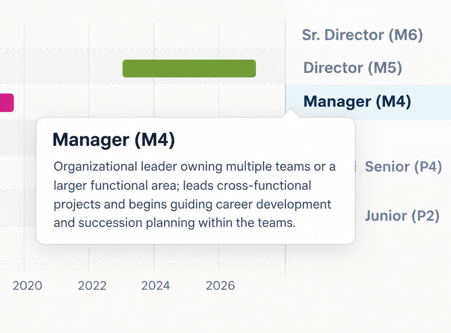
While we were at it, we also cleaned up two of the manager-level descriptions in the underlying leveling framework. They had carried unfilled placeholder text since the framework was first written, harmless when the wording was only used internally, but confusing now that it shows up in the tooltip.
Why it matters
The career ladder chart is meant to be readable by both sides of a hire: the candidate who visualized their own resume, and the talent acquisition professional comparing it against others. Neither should need outside knowledge of a leveling framework to understand what the chart in front of them is saying. Naming every level on the axis and explaining it on hover moves the chart closer to reading on its own.

Talantum builds AI-assisted tools for talent acquisition and HR, including the resume visualization skill for Claude.