Who's Right About Resume Visualization?
Several times, while working on the first version of TalentMap.ru and through later platform releases, I heard from HR people and recruiters that the visual resume format, and resume visualization in general, brings no real value to a recruiter or an HR specialist.
At the same time, the needs of recruiters and talent acquisition specialists have always been my first priority in developing the visual resume standard.
So who's right?
The clutter problem is real, and it's old
As a practicing recruiter myself, I agree with part of the criticism. Extra visual elements on a resume tend to distract and get in the way of absorbing the information it contains.
This isn't new. It started the moment resumes moved to electronic form, whether Word files, plain text, or job site profiles. I remember resumes where candidates played with fonts, colors, and formatting, breaking text into pieces to grab a little extra attention. None of it served a practical purpose. Mostly it came down to a plain desire to add color to the resume, in the hope that the extra visual noise would catch someone's eye.
That's the kind of visualization recruiters are right to distrust.
But a career ladder isn't decoration
The Talantum format isn't a set of infographics slapped onto a resume. The format is standardized, and standardized specifically around recruiter pain points, not candidate self-expression.
Three of those pain points matter most.
The first is the timeline. It seems simple: format the resume, break each job into its own block, and list start and end dates. The candidate assumes this makes it easier to read. But no amount of formatting compares to a standardized timeline that places every role on one axis automatically. It removes any misreading of how one period of work overlaps another. Everything displays cleanly, without the reader doing the math.
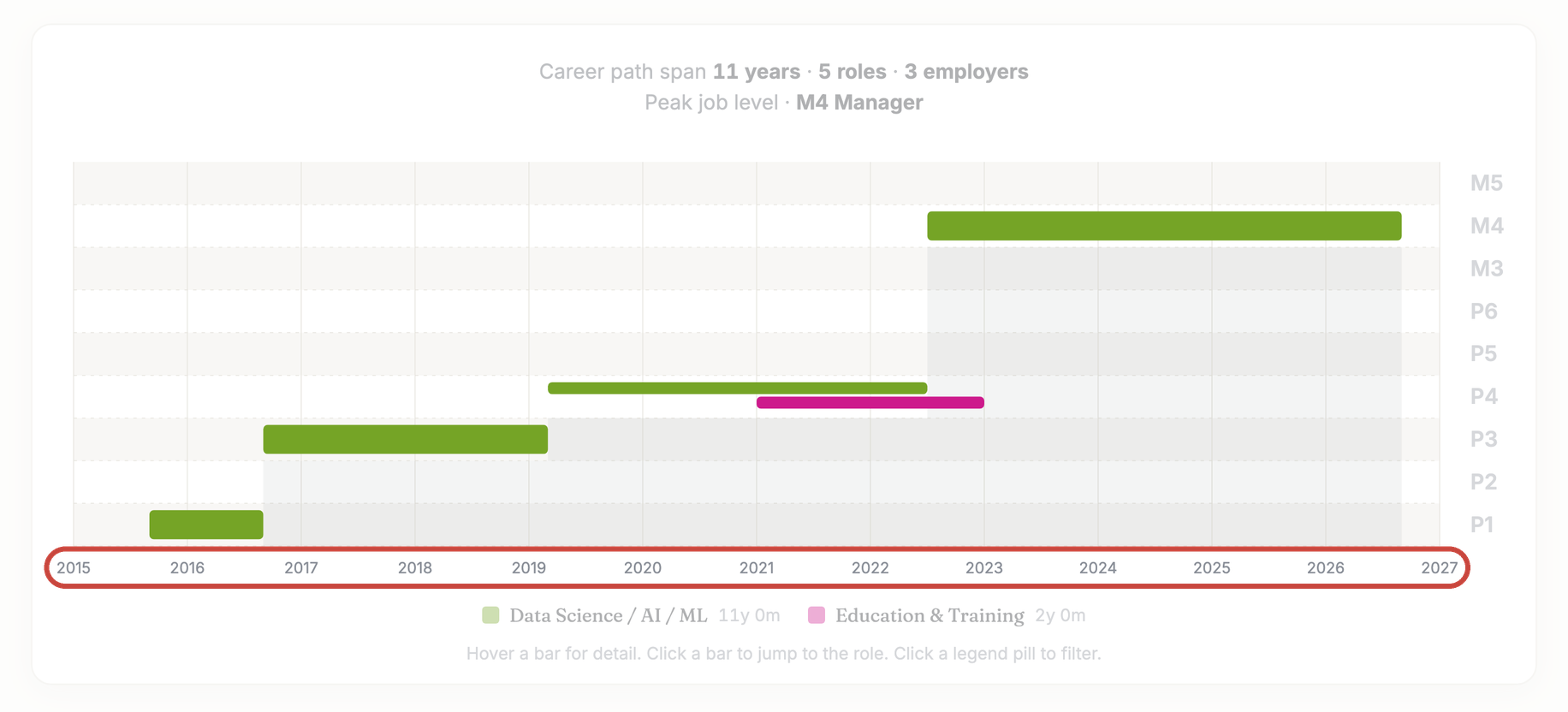
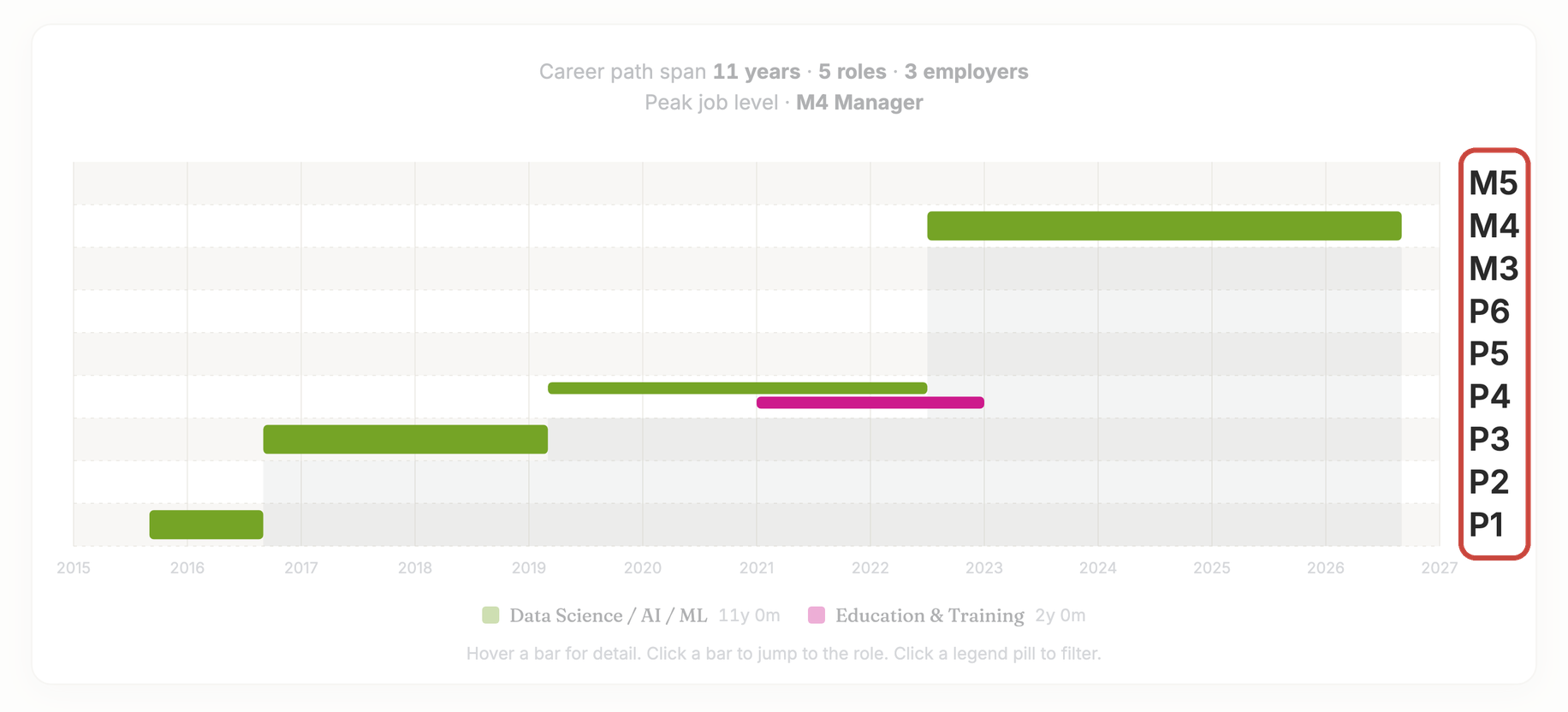
The second is level. Every candidate judges their own seniority in their own way, based on how they see themselves, and there's no single agreed framework for what a level even means. Recruiters don't agree either. One works by one standard, another by a different one. Even letting candidates self-report a level for each job wouldn't fix this, because the inconsistency lives on both sides of the table. This is the part that needed an AI model underneath it, not a form field.
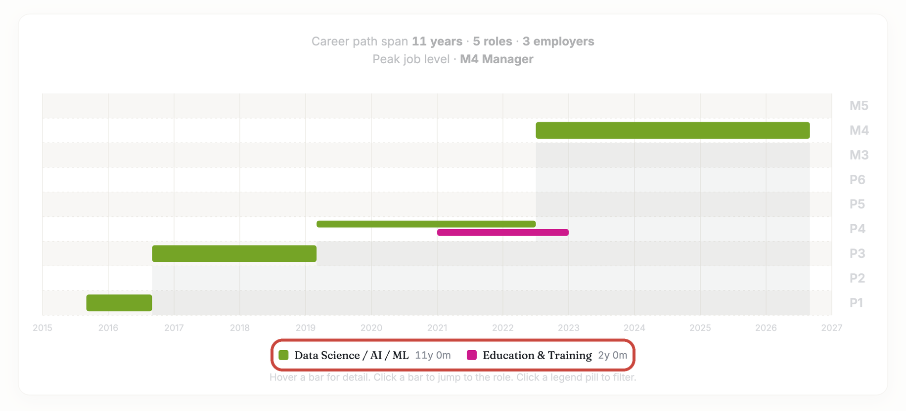
The third is job family, called a professional sphere on the Talantum site. On a plain text resume, a recruiter has to infer job family from the title and the description of duties. That process is always imprecise, and it produces a different answer depending on who's reading. Talantum applies a unified classifier instead, the same one used by government labor agencies, HR information systems, job boards, and salary benchmarking sites, and the AI applies it the same way to every resume it parses. That removes the guesswork and gives the visual resume a consistent way to present career history, which makes reading and matching a resume faster, easier, and more precise.
What one resume looked like in practice
A recruiter who tried it sent back a resume that made the point better than I could. Fifteen years of channel sales in the video surveillance industry. Three "Manager" titles along the way, and one "Director."
Not a single bullet anywhere about direct reports, hiring, or performance reviews.
The tool leveled him as an individual contributor the whole way through, flat for the last nine years. That's the kind of thing a recruiter usually catches only on a second read, if there's time for one.
The timeline told its own story too. All fifteen years on one screen, color coded by function. Thirteen years and eight months in sales, barely two in product management. No scrolling, and no rebuilding the shape of a career from dates in your head.
It also flagged four spots where it wasn't confident, including a date overlap that was most likely just a typo in the resume. Rather than forcing an answer, it showed its reasoning and let the recruiter make the call.
That's the difference standardization is supposed to buy you. Not a prettier resume, but a resume that reads the same way every time, so you can actually compare it to the next one.
Where it helps today, and where it doesn't yet
Visualization works well for a closer look, when a resume has already made the shortlist and you need to understand a career, not just skim it.
It's also genuinely useful at the finalist stage, when a recruiter or hiring manager is comparing a handful of candidates against each other. Seeing their full experience side by side, matching up industry background, professional spheres, and how long each person actually spent in each, is exactly the kind of comparison a plain resume makes hard.
At that stage, ten minutes spent visualizing a candidate's resume is time well spent. The decision on the table is worth far more than ten minutes of a recruiter's time.
To help recruiters use the Talantum format at the finalist stage specifically, I'm working on a separate tool that builds a single visualization page for several resumes at once.
Where it doesn't work yet is first-pass screening. At that stage a recruiter spends seconds on a resume, not minutes, and ten minutes simply isn't available. I'm thinking about how to close that gap. I don't have a finished answer yet, but I believe there is one.
What's next
If resume visualization interests you, stay tuned. Follow the Talantum page on LinkedIn and keep an eye on new posts here. There's more coming.
In the meantime, to see how it works, try the Resume Visualization skill.

Author of the resume visualization methodology and resume-to-job matching infographic, founder of TalentMap.ru (2012)